how i branded brooke marie
EDIT: I found this post written in my drafts from a couple of years ago and I thought it might be of some use to someone <3
Hello! I just wanted to share with you how I managed to brand Brooke Marie, hopefully by sharing my stab in the dark attempt at branding it might help you with yours. I’ve included things like how I finally decided on my colours, my fonts and the thistle logo, and there’s also links to the wonderful content on the internet that helped me all the way through.
It can be a fairly daunting prospect branding your new side-hustle or business. If you feel a little overwhelmed with how to go about it then I know exactly how you feel, I was the same. All of those important decisions to make with absolutely no experience to back them up, it’s terrifying actually. But, there are plenty of resources out there to help us…
Simple & Season Podcast & Blog
Before you start anything I strongly recommend listening to this podcast. It’s brilliant. By the time I’d listened to one season I felt raring to go and I was so much more confident in what I wanted to achieve. Kayte has created an amazing resource for creative businesses. she shares her podcast Grow With Soul and it walks you through some excellent slow and simple marketing techniques that leave you feeling inspired. Everything she says just makes sense and I can’t recommend her content enough. You can find her excellent blog content and her Grow With Soul podcast at www.simpleandseason.co.uk
Choosing A Business Name
After hours and hours of torturous thinking, to the point of actual brain pain, I opted for Brooke Marie. It had to be my name because it’s the only consistent thing about me. I can’t really get bored of it because well, I can never change it. My parents labelled me Brooke Marie Collett and now I’m stuck with it so I might as well put It to some use. Why couldn’t I have been born into a family with a surname like Wilde or Fotheringay or something cool? Brooke Wilde would have been awesome! But alas, it wasn’t meant to be. Marie is my middle name, I chose this because I’m getting married this year and I’m no more fond of my future second name than I am of my current one, so middle name it is.
Choosing fonts
For my logo I tried and tried to hand write my own font but I just didn’t like any of them. Brooke because of it’s annoying double O seemed to me to look silly. In the end I trailed through the whole 1001 fonts and settled on the only one that looked right. Website fonts were a little more tricky, there are so many options but in the end I always gravitated to the same. I’m partial to a typewriter so when i stumbled on my “John Doe” heading font I was chuffed. As you scroll through the font choices you will notice fonts that you’re drawn too and there are plenty of articles online that can help you decide. I would choose no more than 3. There are some theories on the types of fonts you should pare with other fonts but really I would just go with clear and simple for the body text and then find the fonts you like for your headings and branding.A Brand Font
A Heading Font
A Subheading Font
A Body Font
Finding your colours
If you really think about it you’ll notice you’ve always been drawn to some colours over others. You’re favourite clothes are usually in your preferred colours. The clues are around you in your home, what do you usually buy? For me I always go for really natural textures such as linen, wool and wood. My favourite colours are also earthy colours often found in nature such as muddy greens and browns. Colour theory would probably put me as an autumn personality opting for cosy texture over bright spring colours. There’s a great seasonal branding personality quiz here…. www.everydayartefacts.co
Creating my logo
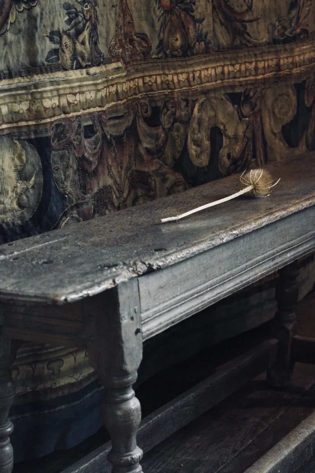
My graphic design knowledge is limited but I do know a logo should be relatively simple. If you can afford a graphic designer then please go for it they’ll do a much better job, but If you can’t afford one like me then a little sketch, scan and bit of photoshop can work wonders. When deciding on a graphic you can opt for an obvious one that illustrates what you do. I.e. a paintbrush or a pencil of some sort, or you can go for something with less of a logical point behind it. You could also simply have lettering. The choice is endless. I think it helps to get on pinterest and pin pin pin all of your favourite branding. In the end I went for something that represented simplicity calm and happiness for me. I knew I wanted it to be something from nature, something that I didn’t tire of, something around me on a daily basis that connected me to the earth, but I didn’t know exactly what that was. Weeks went by with me painting olive branches and cow parsley in all sorts of combinations but none of them floated my fancy.. Sometimes it’s best to just go for a walk and let nature slap the idea bang square in your face instead. That’s what happened with my logo. After a trip to Haddon Hall (my favourite old house) I saw these dried teasels laid on all the old furniture so you don’t sit down and I just thought they were so beautiful.
I didn’t think anymore of it until I was back home and walking Otis on our usual route. We regularly meander alongside the farm dyke for a mile and a half before we reach the beach, it’s our favourite walk, it’s when were both at our happiest. Him with his nose in a mole hill, me daydreaming of all the beautiful things I want to paint. The whole way there the banks are lined thickly with teasels, even in the dead of winter their dried shapes stand tall in the gloomy morning mist….. yep, you guessed it, inspiration clonked into my head like a pound into a piggy bank.
6. Carissa Tanton
The amazing creative helpful person that she is, has provided links to a few eco friendly packaging companies. I couldn’t have done it without her. https://carissatanton.wordpress.com/sustainability/
7. Website platforms
I’ve had practice on quite a few website providers and I’ve found most of them frustrating, apart from this one that I’m using now. If you have the time spend a few evenings trialing the different platforms. What works for me won’t necessarily work for you but I’ll give you a quick break down anyway.
Wordpress - I like Wordpress very much but I found unless you spent £180 on a theme the website never looked very professional. If you do invest the money though they can be absolutely beautiful.
Go Daddy - I set up my sisters website on this platform for her beauty business. It felt restrictive and well it just bloody irritated me. She closed it pretty soon after as she was busy enough on Facebook. This was a few years ago though so it may have improved.
Wix - I loved Wix to start with, the versatility of it was great. You could really go to town with the design. It fell short though with the mobile side of things. You had to constantly check how things looked on the mobile and they usually didn’t convey very well.
Squarespace - My favourite! It took a little fiddling to get used to how it worked but once you’ve got your head around it I think it’s one of the most simple. There’s no fighting to get things in a nice line and I find the commerce side of it so easy to use. There are some downsides though, the slideshows aren’t great and the title area isn’t particularly flexible.


